


 In this chart, the 50-hour MA (red line) crosses above the 200-hour MA (green line). The price of USD compared to AUD was already strengthening but displayed a notable uptrend of several days at the exact moment of crossover.


Death Cross and Golden Cross: Intro
The death cross and golden cross indicators are two relatively easy patterns to learn for traders learning technical analysis. Both indicators make use of two moving averages (MAs) to signal when price action turns bullish or bearish.
A moving average is a line plotted on a price chart that tracks the average price of an asset over a specific time frame. For example, a 50-day moving average will measure the average price over the past 50 days, updated every day as a rolling average. A short-term moving average exhibits choppier price movement while long-term moving averages, like a 200-day MA, are plotted as smoother, less volatile lines.
When searching for golden crosses and death crosses, a 50-day moving average and a 200-day moving average are typically used. However, you can adjust these MAs to best fit your trading strategy.
Keep reading to learn about the two indicators in more detail, how to spot them and examples of both the golden cross and death cross.
What is a death cross in trading?
A death cross is a chart pattern that occurs when a short-term moving average crosses below a longer-term moving average. The death cross signal is classified as a bearish signal, representing the beginning of a downtrend in price action.
The death cross indicates that price action has fallen during the term of your shorter moving average – about two months with the use of a 50-day MA. The shorter average, which represents more recent price action, has fallen below the longer MA, representing historical price action.
It can be helpful to think of this crossover in shorter time frames: if the value of an asset is higher yesterday and today than its average price over the last week, it must be rising in value. If the value of an asset is lower today than its average price over the past week, it must be falling in value.
How to spot a death cross
You can spot a death cross by identifying when the longer-term moving average crosses above the shorter-term moving average. The death cross occurs in three phases:
- Sustained uptrend: The market’s price exhibits an uptrend where a 50-day moving average is above a 200-day moving average
- Crossover: The price reverses and the 200-day moving average crosses over the 50-day moving average, beginning a downtrend and creating a death cross on the price chart
- Bearish downtrend: The price continues its downtrend and the 200-day moving average remains above the 50-day moving average, confirming the downtrend
The death cross can present a fake signal, where the price action finds a bottom shortly after and rebounds on its upward trend.
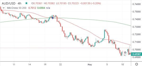
Example of a death cross trading pattern
In the AUD/USD chart above you can see the 200-hour MA (red line) cross above the 50-hour MA (green line) while a sharp drop in the value of USD compared to AUD occurs immediately after.
What is a golden cross in trading?
A golden cross is a chart pattern that occurs when a long-term moving average crosses below a shorter-term moving average. The golden cross is considered a bullish signal, representing the beginning of an uptrend.
A golden cross indicates when the price action enters a bull run and is the inverse of the death cross indicator.
How to spot a golden cross
You can spot a golden cross by identifying when a short-term moving average crosses above a longer-term moving average. The golden cross occurs in three phases:
- Sustained downtrend: The price action begins in a downward trend, with the 50-day moving average sitting below the 200-day moving average
- Crossover: The 50-day moving average crosses above the 200-day moving average, signaling a reversal in price action to an uptrend and forming the golden cross on the price chart
- Bullish uptrend: The uptrend continues and the 50-day moving average remains above the 200-day moving average, confirming the golden cross
Traders should wait to see if the trend continues or if the moving averages reverse across each other to avoid potential fake-outs before entering a position. You may be tempted to enter a long trade as soon as you identify a golden cross, but you should confirm this signal with other indicators before taking action.
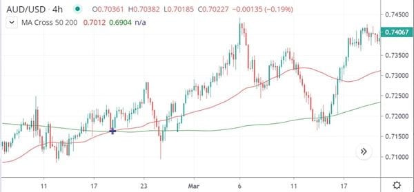
Example of a golden cross trading pattern
In this chart, the 50-hour MA (red line) crosses above the 200-hour MA (green line). The price of USD compared to AUD was already strengthening but displayed a notable uptrend of several days at the exact moment of crossover.
How reliable is a death cross or golden cross?
The golden cross and death cross indicators have proven useful for many markets including stocks, forex, and cryptocurrency. However, every market has its own fundamental influences and varying levels of volatility.
As with most trading patterns, indicators are more reliable with higher timeframes. This means a 1-hour and 5-hour moving average crossover is a weaker indication of price action compared to a crossover involving 50-hour and 200-hour moving averages.
It’s important to keep in mind moving averages are lagging indicators, meaning they show only what has already occurred in the market. If a death cross or golden cross appears on a price chart, the market has already moved in that direction. Lagging indicators like the death cross and golden cross are best used to confirm other leading indicators such as the Relative Strength Index (RSI) or Stochastic Oscillator.
How to use death cross and golden cross indicators
Ready to use these crosses in your own technical analysis? Follow these 4 steps to start trading the golden and death crosses.
- Open your City Index account. It’s free and typically takes less than five minutes. Already a customer? Log in here
- Add some funds so you can start trading instantly
- Choose the FX pairs you’d like to trade. Popular markets include EUR/USD, GBP/USD and USD/JPY
- Find opportunities using our range of trading tools: including indicators like the golden cross and death cross, advanced charts and SMART Signals
- Open your first position
Not sure you’re ready for live markets yet? Test out our platform with a City Index demo, featuring virtual funds so you can try out trading on our full range of markets.
Latest market news
April 28, 2024 02:00 PM
Yesterday 03:00 PM
Yesterday 01:12 PM
Latest trading articles
August 11, 2023 10:00 AM
March 17, 2023 06:53 PM
January 12, 2023 04:30 PM
October 27, 2022 04:45 PM