
S&P500 Forecast: SPX rebounds as big tech recovers & inflation is in focus
Article
Today 2:32 PM


Some technical indicators are suitable for beginners, but others require more in-depth knowledge. In this lesson, we’ll cover the more complex indicators that can help boost your analysis.
Advanced technical analysis is the practice of employing more than one technical indicator or a more complicated indicator to predict price movements.
Before you can perform advanced technical analysis strategies, you’ll need to understand the basics of using charts and indicators. If you don’t, take a look at our introduction to technical analysis course.
We’re going to take a look at three popular indicators that fall into the advanced category due to the complexity of their equations and their tendency to give false signals.
While false signals might seem like an immediate red flag, it just means you’ll need to confirm them with other indicators. We call this a ‘multi-indicator strategy’.
Fibonacci retracements are one of the most popular tools for identifying support and resistance levels. They help traders find the best points for stop-loss orders and price targets.
The indicator is based on the mathematical sequence identified by Leonardo Fibonacci in the 13th century. The ratios between each of the numbers in his sequence is the most important part for traders. These are 23.6%, 38.2%, 50%, 61.8% and 100%.
Fibonacci retracements are calculated by taking two price extremes on a chart and dividing the vertical distance between them by these ratios.
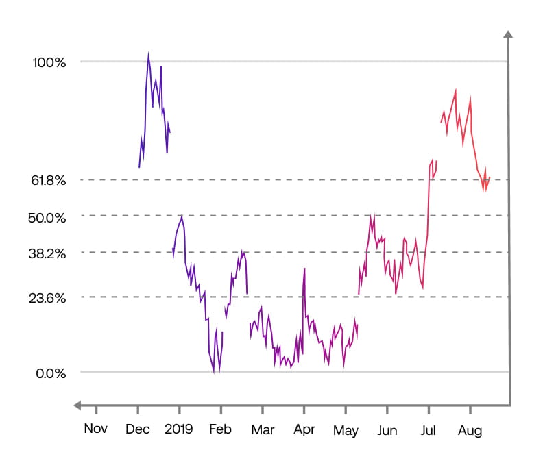
Once these lines are in place, they can be used to determine where an asset’s momentum is more likely to decrease and so find the key areas where its price could reverse.
The idea is to place a stop loss at the key level that has just been broken and a take profit at the next retracement level in anticipation that the market may exhaust itself.
For example, if the market rises back to the 38.2% level from its previous fall, then the expectation is for the 50% retracement to be the next resistance level or profit target. You will want to confirm bullish pressure before entering the market and place a stop loss at 38.2%.
Once the market breaks through that 50% retracement level, then 61.8% would be the new target and 50% would be the new stop loss level. And so on and on.
Fibonacci lines are used as a confirmation tool, so they are used as just one part of a multi-indicator strategy. For example, most traders will combine the tool with the MACD or stochastic oscillator and look for points where the indicators cross over Fibonacci levels as confirmation of a trend.
Although believed to be a more advanced tool due to its mathematical background, most trading platforms do the calculations automatically for you, making Fibonacci retracements more accessible.
You just need to select the price low and high on your chart and the indicator will mark the ratios for you. If you wanted to trade a downtrend, you’d just do the reverse, first selecting a high and then selecting the low.
The Ichimoku Cloud is a collection of indicators that show support and resistance lines, as well as momentum and trend.
It’s been a popular choice among Asian traders for years but is becoming more widely used internationally. The indicator is known as the ‘one glance’ indicator, because when it’s used on a chart it gives an overall view of the market.
The ‘cloud’ consists of five lines:
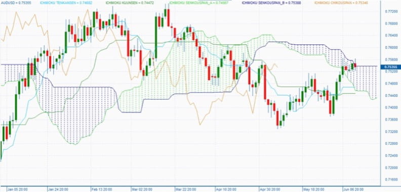
The Tenkan Sen is the red line on the chart. It represents the average of the market’s highest high and lowest low over the last nine periods – for example, this is a daily chart, so it’ll show the high/low over nine days. It’s the shortest timeframe in the Ichimoku Cloud, so it’s often where the first sign of change in the market appears.
The Kijun Sen is the light blue line. It represents the average of the highest high and lowest low over the last 26 periods – making it slower to indicate change than the Tenkan Sen. It’s thought to identify nearby support and resistance levels, so is commonly used to place stop-loss orders.
The Tenkan Sen crossing from below to above the Kijun Sen line is a buy signal. While a crossing from above to below the Kijun is a sell signal.
The Senkou Span A is the average value of the Tenkan and Kijun plotted 26 periods ahead, and the Senkou Span B is the average of the highest high and lowest low over 52 periods, also plotted 26 periods ahead.
The space between the two is known as the Ichimoku Cloud, which is the area on the chart that is either shaded red or green. As the lines are plotted ahead, it extends past the latest live price and acts as an indicator for future prices.
The Cloud also acts as a zone of long-term support and resistance – rather than simply a line. The longer the trend continues in a certain direction, the wider the cloud becomes. This means the price will have to significantly reverse to overcome the support or resistance area that has formed.
The dark blue line is the Chinkou Span, which represents the closing price of the current candlestick plotted 26 periods into the past. The line will trail behind all the other lines, because they’re all focused on present and future price action. If the end of the Chinkou Span is below the Ichimoku Cloud, it indicates a downward trend, if it’s above the Cloud, an uptrend is underway.
The DeMarker indicator, more commonly known as DeMark or just DeM, is a tool that compares the most recent price high and low to the equivalent in the previous period. It helps measure the demand in the market, giving a clear indication of the direction of a trend.
The DeMark is an oscillator and will be shown on its own graph below the main price chart. It is composed of a single fluctuating curve between zero and one.
There are lines drawn at 0.30 and 0.70 that indicate boundaries where price reversals could occur.
When the DeMark curve crosses above or below these levels, the market is believed to be overbought or oversold. Values below 0.30 are seen as bullish, and values above 0.70 are seen as bearish.
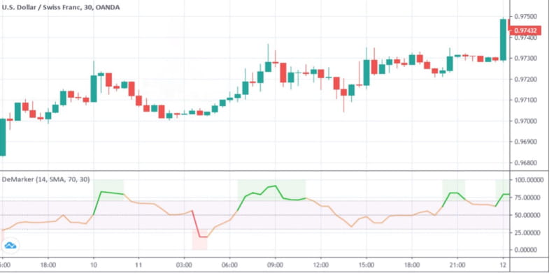
It’s used over short timeframes, normally only 14 days, which make it more common among day traders and swing traders. But, in theory, there’s nothing to stop you from using it over longer periods.
Unlike other oscillators, the DeMark focuses on intra-day highs and lows, not just closing levels. This means that data appears smoother.
It is considered a leading indicator because it signals an impending change in direction, rather than a move that’s underway already. This does mean it can be prone to false signals and because of this, the DeM should never be used on its own but as part of a multi-indicator strategy.