
S&P500 Forecast: SPX rebounds as big tech recovers & inflation is in focus
Article
Today 2:32 PM

As we’ve seen, technical analysts believe that trading charts can suggest where prices may move to in the future. So, let’s take a look at how to read them
As we’ve seen, technical analysts believe that trading charts can suggest where prices may move to in the future. So, let’s take a look at how to read them.
How you read trading charts depends on a few factors: time, chart type and patterns.
Each period you’re shown on a chart will cover a different amount of time. For example, if your chart is set to ‘five minutes’, each candle or bar would show you the last five minutes of price action. If it’s set to daily, each candle or bar would show you the price action for the last 24-hour period and so on.
The most recent candle is the only exception – it shows you the current session, rather than historical data.
Popular short-term timeframes usually range from five to 60 minutes. If you want to hold positions for more than a few hours, then you’d look at daily charts for an intermediate time frame. Whereas weekly and monthly charts would be used for longer-term trades.
You’ll be in control of your chart’s timeframe, and you can quickly toggle between different scales in platform.
There are a few different types of trading charts available, the most popular two are bar charts and candlesticks.
For advanced traders, we also offer a more sophisticated range of chart types including Heikin Ashi, Renko and Point-and-Figure charts that are used to improve the isolation of trends and predict possible future movements.
But let’s look at the main two now.
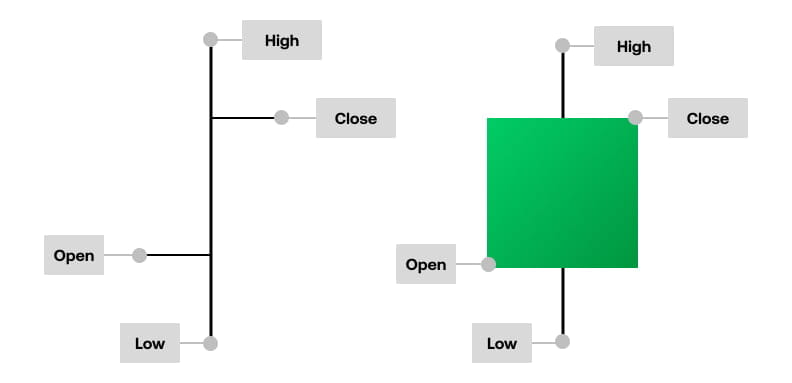
Bar charts show the market’s high and low over a given trading period. They’re usually comprised of a vertical line that connects the high and low of the period and smaller horizontal lines which indicate where the market opened and closed.
The open price is the horizontal notch on the left, and the closing price is on the right.
They’d look like so:
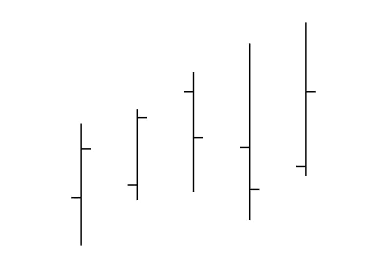
Each bar shows a particular timeframe, whether that’s an hour, day, week or month. They’re widely used by both short-term and longer-term traders.
Candlesticks are the most popular price chart. There are three components of a candlestick: the body, the wick or shadow and the colour.

The body of a candle displays the difference between a market’s opening and closing prices. Generally speaking, the longer the body is, the more intense the buying or selling pressure is.
The vertical line, known as the ‘wick’ or shadow, shows us the high and low within the timeframe. An upper shadow displays the highest price that it traded during that particular session, while a lower shadow shows how low the price went.
And the colour of the candle tells us whether the market ultimately moved higher or lower in the session. A green candle indicates that the price has risen within the session, and a red candle indicates the market has fallen.
Candlesticks represent the battle between buyers and sellers over a given period of time, which can help traders to make a decision on whether to enter a bullish or bearish position.
For example, long green candlesticks are generally bullish candles as they indicate that there was a lot of buying pressure throughout the period, causing the close to be so much higher than the open. When they appear after extended declines, they can indicate a potential turning point in the trend, or a support level.
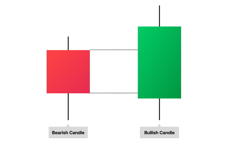
Conversely, a long red candle normally indicates strong selling pressure as the close price is well below the open. If the market has been falling for some time, a long red candle might indicate that the trend is coming to an end, or it could or mark a future resistance level.
Candlesticks with a long upper shadow indicate that buyers dominated the session – but then sellers forced prices down from their high before the market close.
Conversely, candlesticks with long lower shadows indicate that sellers dominated the session, but buyers later came in and pushed prices higher at the end of the session.
The final consideration for reading charts are known patterns. These are the reoccurring shapes that appear within price charts. They’ll appear differently depending on your chart style, but broadly they’ll help you to identify everything from trends and momentum to divergences and reversals.
You can learn more about the types of patterns in the next lesson.