


This piece from 30 December was posted with permission by Rhona O’Connell, Head of Market Analysis for EMEA and Asia at StoneX Group. Please visit the StoneX Market Intelligence portal and consider subscribing for more of Rhona and team’s research.
- Does the current relationship between gold, silver and copper match up with any previous period?
- Is there anything special about the current trends?
- Colour charts near the end of the article show key similarities and contrasts
- Technical analysis; non-committal medium term, but under stiff resistance in the short term
The gold:silver ratio is a much-watched indicator in the precious metals markets and is often traded as an entity in its own right. In this brief study we look at a series of periods in which the ratio has changed sharply, as well as the longer, shallower periods in between. The observations show that the relationship is not as predictable as might at first be thought.
Because of silver’s dual nature, both as a precious metal and as an industrial commodity (industrial demand typically constitutes 60% of global silver fabrication demand—i.e. excluding jewellery, coins&bars, silverware and ETPs), it is also valid to look at the silver:copper relationship, and gold:copper occasionally also comes under scrutiny. So we have also looked at how the latter two ratios fared during the same periods that we are looking at with respect to gold and silver, and set them against economic and financial developments to see if there is any consistency.
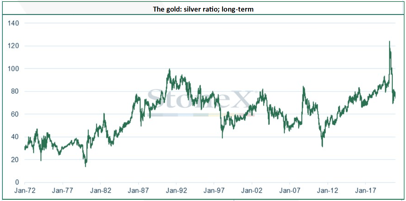
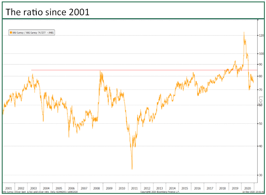
The chart below is a simple historical view of the gold:silver ratio since the dollar came off the gold standard. Overleaf we take a rather more technical view. The chart goes back to the start of 1972, which gives gold a little time to find a neutral market price after President Nixon closed the gold window on 15th August 1971. It was at that point that the two-tier system in the gold market was stopped. The London gold pool had collapsed in March 1968 in the face of relentless gold demand, and at this point the spot price came away from the previously fixed level of $35/ounce and a two-tier system was developed, with central banks continuing to trade at $35/ounce. Eventually this became unmanageable, especially as some banks were buying gold at the central bank fixed price, selling it in the free market and taking the profit. So the gold window was closed and the dollar started to float free from $35. As an aside, the Federal Reserve still values its gold reserves at $42.22/ounce, the free market price on the day the window was closed.
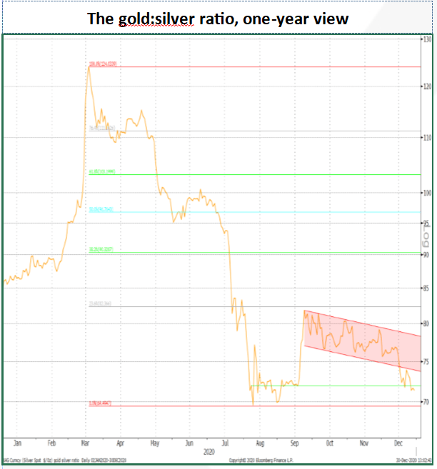
The ratio has averaged 59.6 since the start of 1972, with a low of 14.0 and peaking at 124.0 on 18th March as silver crumbled to eleven-year lows below $12 in the COVID meltdown, while gold was rallying from four-month lows. As we write the ratio has dropped below the key 72.0 level, and, in combination with the fundamentals, is sending quite a strong signal for the next move.
Source: Bloomberg, StoneX
Source: Bloomberg, StoneX
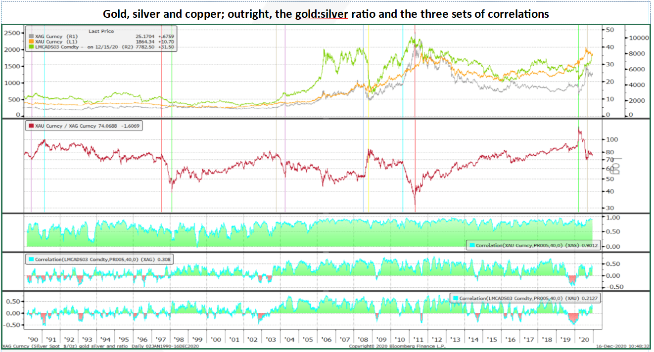
The chart above looks at gold, silver and copper from the start of 1990. The vertical lines highlight the periods when the gold:silver ratio changed sharply and these can be summarised into four contractionary periods; three of these are associated with a bull gold market, as should be expected given silver's higher volatility compared with gold, but the first actually saw gold in a mild bear market. We come back to this further on. There are two sharply expansionary periods, both associated with a bear gold market. In between, there are two periods of gradual contraction and two of gradual expansion.
So what do these periods have in common, if anything?
The Contractionary Phases:
- Weakening dollar; phases 2, 3, 4
- Fed balance sheet expansion; phases 3,4
- Concern over equity valuations; phases 2,4
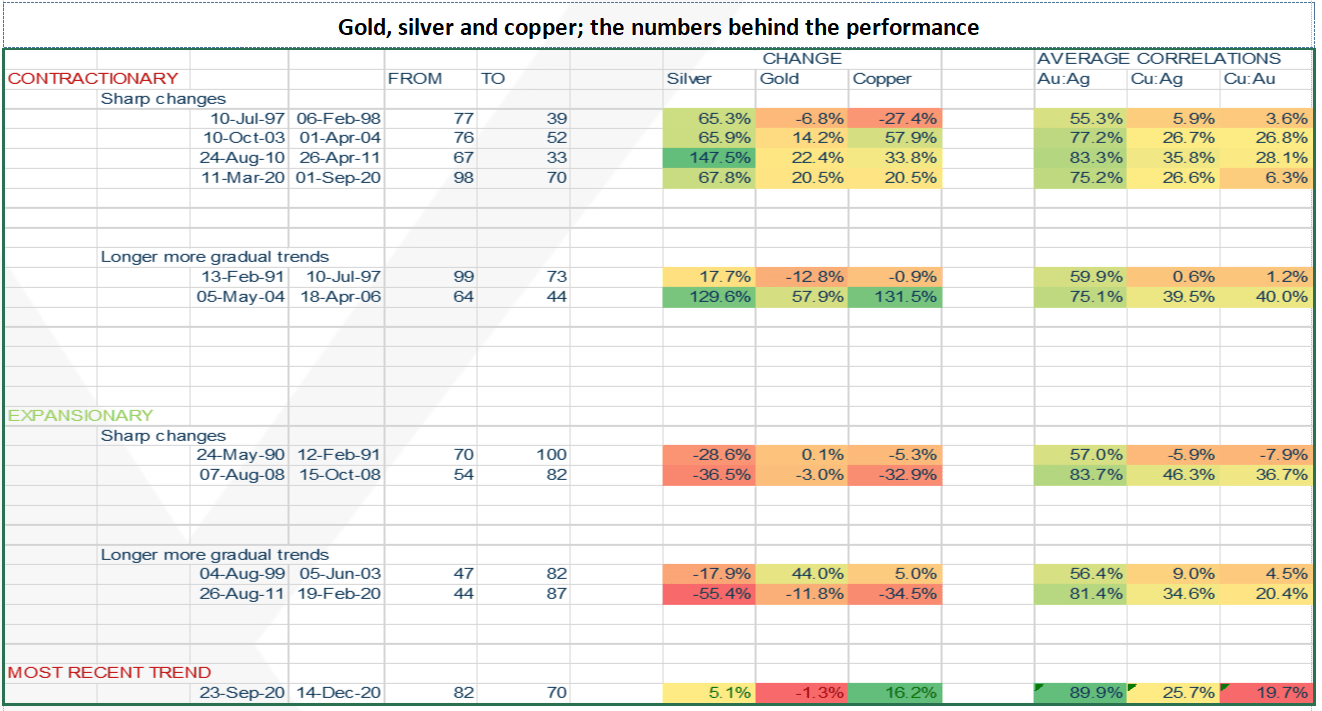
As noted, there are four of these. We will look at the earliest one last as it is very much a one-off. The other three ran from October 2003 to April 2004, August 2010 to April 2011 and then the recovery from the meltdown earlier this year, running from March to September. As the following table shows, in all three cases the three metals moved in the same direction, with silver posting the largest gains and copper ranking second (apart from this year when gold and copper posted the same increases).
All three bull phases have a weakening dollar in common, with the latter two also characterised by expansion of the Fed’s balance sheet (which of course would affect the dollar); the second was the onset of QE2 (the second phase of post-Lehman quantitative easing), while the Fed’s balance sheet activity has been front-and-centre in financial market sentiment this year. The first, while dollar-related, was also bound up with concerns over the outlook for U.S. equities and the search for alternative assets. This is also relevant in 2020, with equity valuations way out of kilter, especially given the uncertain economic outlook, along with the excess liquidity in the markets, which is searching for a home. Gold is a beneficiary here, and silver’s association with gold and its higher volatility means that silver has reacted accordingly (note the 8,000t-plus increase in silver ETPs this year, equivalent to roughly four months’ global fabrication demand).
Source: Bloomberg, StoneX
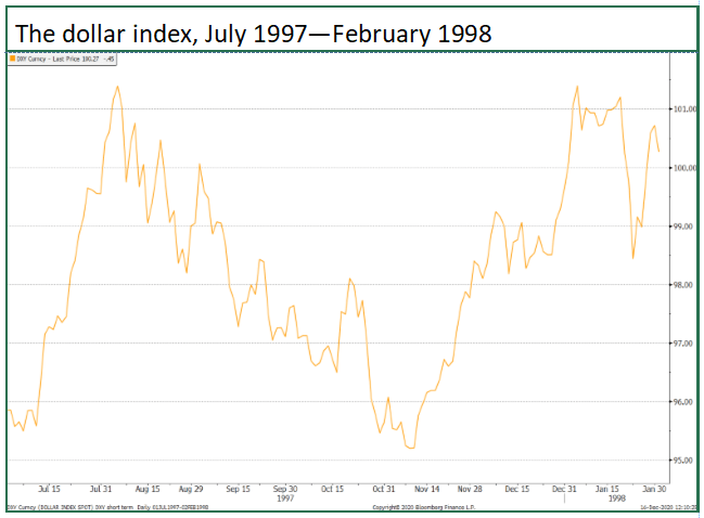
The outlier here is, of course, phase one. Between July 1997 and February 1998, the dollar was essentially neutral (see chart below) and gold posted a small decline despite the East Asian currency crisis as the return of metal to the market and a large increase in liquidity kept the price under some light pressure via mine hedging along with short selling, while, importantly, sentiment was bruised by sporadic large‑scale official sector sales.
Silver, however, recorded a 65% gain, even as copper dropped by 27%. Cue Mr Warren Buffett, the legendary investor, whose vehicle Berkshire Hathaway started buying silver in late July 1997 and which by late January the following year held 4,034t. Allied to this was a liquidity squeeze that at one point saw lease rates in excess of 70%. Buffett was of the view that equilibrium between silver supply and demand would only be achieved at higher prices and invested accordingly.
Source: Bloomberg, StoneX
The Expansionary Phases
Þ Economic contraction
In the first phase, from May 1990 to February 1991, gold was barely changed, while hard asset prices (and U.S. real estate) were falling amid global GDP contraction. Gold remained relatively robust on risk hedging, not just from a financial perspective, but geopolitical risk was important, with Iraq invading Kuwait. The well-publicised heavy sales from NCB Jeddah, reportedly to fund the purchase of bombers, was relatively well-taken, with the risks in the Middle East a stronger informer of sentiment.
The second phase revolves around the financial crisis in 2008, with Bear Stearns collapsing in March (and bought by J P Morgan), the mid‑September collapse of Lehman Brothers and the ensuing turmoil in the financial sector. Gold’s marginal fall was due to the legacy of distress selling, while silver, unimpressed by gold’s apparent lack of performance, slipped further, with the underperformance also encouraged by the slide in copper.
Correlations
Which brings us onto the correlations between them in their three pairings. Bear in mind that “correlation” does not necessarily mean “direction”.
It will come as no surprise that silver’s relationship with gold is generally considerably stronger than it is with copper, averaging over 70% for the phases under observation. The average correlation with copper is just over 20%. There is no clear pattern in that of silver:copper with economic conditions, although the highest correlations do tend to be when there are tangible changes in economic conditions. This was most notable in 2008 when economies went into contraction, and in August-10/April-11 and May-04/April-06, with confidence growing in the former case and growth generally strong in the latter.
Overall patterns; a good indicator? Not really
The formatting of the cells in the table above helps to clarify the patterns in the market moves; the deeper the red the lower the number, up to an intense green for the higher figures. Interestingly there is no repeat at all in the patterns of percentage changes in prices—the closest match is the latter two sharp contractionary phases, although even here the link is tenuous, with copper outperforming gold in the third phase but the two of them hand-in-hand in the final one.
Within the correlations there is a slightly tighter set of relationships, in that in eight instances from our sample of eleven, the correlation between copper and silver is higher than that between copper and gold. The exceptions were in the periods of very gradual contraction, but in neither case is the argument compelling. In the first instance, which was a period of reasonable economic growth and relatively low distress, the correlations themselves were almost non-existent. The second was in a period of strong growth, finishing off with a collapse in the dollar, which would have informed the closer relationships than in the earlier phase.
And now?
Our current phase, which is a contractionary one, reflects gold and silver tapering off as the markets watch the vaccine developments and the tortuous progress towards fresh economic stimulus. A key element is copper outperforming the other two; this is partly a supply chain issue from earlier in the year that is still knocking on into the underlying fundamentals; the primary focus though is the overall base metal suite’s seeming confidence in the economic recovery in China and some anticipation of eventual improvement elsewhere. Silver, meanwhile, continues to be churned out as a by-product of other metals and is therefore to some extent impervious to China’s activity while gold is concentrating on risk appetite
The technical view
Source: Bloomberg, StoneX
Reversion to the long-term mean looks impossible over any medium-term time horizon. A simple reading of congestion bands points to a viable broad range of 67 to 82, while a 2020 Fibonacci retracement points to 82.4 as the upper level of the band. Were this to be broken the next target would be 90.6. To the downside, in a contractionary environment, Fibonacci analysis pegs support at 67.8. So the Fibonacci and congestion analyses are more or less in line with one another.
Source: Bloomberg, StoneX
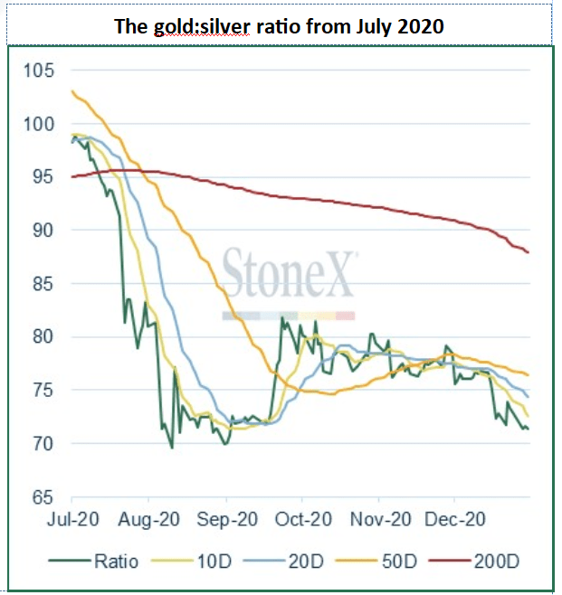
In the short term the ratio has broken below its recent downtrend, to stand, as we write, at 71.4. For a trend to be properly broken, the key support area needs to be penetrated by 3%. So, as the ratio has now dropped to below 72.0, then that recent downtrend channel will start to serve as resistance.
Source: Bloomberg, StoneX.
Meanwhile the moving averages are in bearish formation for the short term, with the shortest average at the lowest and the longest, the highest. Strong resistance stands between 76.1 and 77.4.
Going down?
Technical analysis must always ignore the fundamentals, but the same does not apply in reverse. The current structures suggest that the ratio is going lower. The fundamentals suggest that gold is going higher. If this all comes about, then silver should outperform gold in the coming months. Phase 4 to be reprised?
Latest market news
Today 01:15 PM
Today 07:49 AM
Today 04:24 AM
Latest Gold articles
April 1, 2024 01:09 PM
March 28, 2024 10:30 AM
March 26, 2024 11:24 PM
March 26, 2024 12:00 PM