
S&P 500 Forecast: SPX steady with Middle East tensions & Netflix in focus
Article
Today 11:23 PM


They may suggest where prices may move to in the future based on technical factors like chart patterns and indicators.
Charts are particularly important to Technical Analysts as they believe that past patterns are based on human behaviour and often repeat themselves.
Technical Analysts use chart patterns to help predict where prices may move to in the future and they are used to spot trading opportunities.
So what information is contained within these charts and how do you "read" them?
A trading chart is made up of three major components: Time, Price and Patterns.
In this example we're using a chart for the GBP/ USD currency pair and we can see the price displayed on the vertical or 'y' axis and time displayed on the horizontal or 'x' axis.
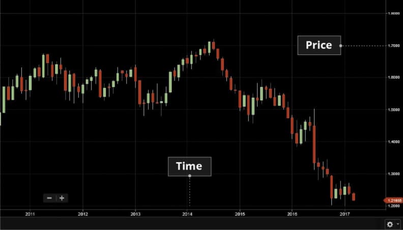
If we want to find out more about how the price of sterling dollar has changed over time, then we could use the drop down menu to choose a timeframe from 1 minute to 1 year.
Popular short-term timeframes usually range from five to 60 minutes. If we want to hold positions for more than a few hours, we could look at daily charts for an intermediate time frame. Weekly and monthly charts on the other hand could be used for longer-term trades.
The second major component of a chart is the price.
When looking at a chart you can choose to view the bid, mid, or ask price.
Price movements can be displayed in different ways on charts using lines or bars for example, but one of the most popular with traders are candlesticks.
Candlesticks are very useful as they can help us to determine the direction of the market with just a glance.
By looking at the colour and length of the candlestick, we can tell if the market is getting stronger or weaker, and whether that direction is a short-lived spike or a legitimate change in direction.
Each candlestick shows key data for a specific period.
Example
This euro dollar chart has a 10 minute time scale, and each Candle represents the trading activity for a 10 minute period.
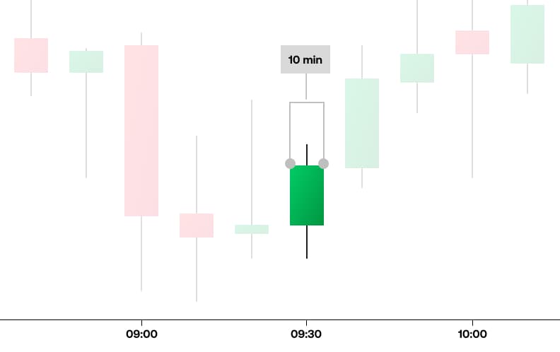
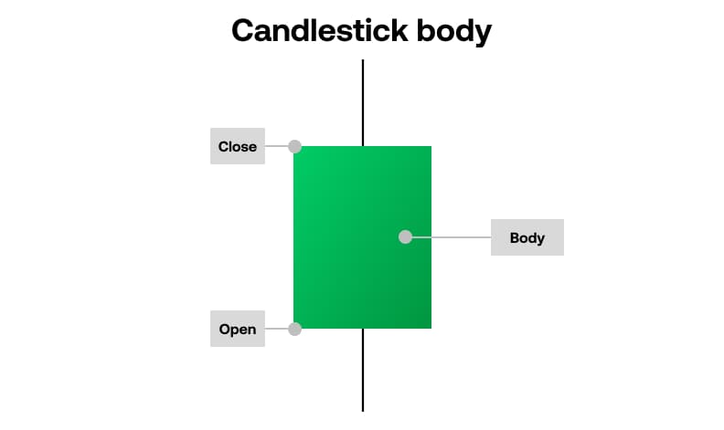
The Candlestick Body is a rectangle that represents all of the trading activity for a specified period.
When the price rises, the candle will be green, and when the price of that market drops, the candle will be red. This gives us a visual snapshot of price movement at any given moment. On a green candle, the open price is represented at the bottom of the candle body and the top represents the close price.
Generally speaking, the longer the body is, the more intense the buying or selling pressure is.
Long green candles are generally bullish and, after extended declines, might indicate a potential turning point in the trend, or a support level.
Long red candles might indicate strong selling pressure as the close price is well below the open. If the market has been rallying for some time, a long red candle might indicate that the trend is coming to an end, or it could or mark a future resistance level.
Candlestick shadows, sometimes called tails or wicks, are the thin lines that we see above and below the candle body.
An upper shadow displays the highest price that it traded during that particular session, while a lower shadow shows how low the price went.
Candlesticks with a long upper shadow and short lower shadow indicate that buyers dominated the session but then sellers forced prices down from their highs.
Conversely, candlesticks with long lower shadows and short upper shadows indicate that sellers dominated the session but buyers later came in and pushed prices higher at the end of the session.
So in this daily euro dollar chart, we can see that the buyers had control for over a week, pushing the price higher but at this point the sellers came in and we had a change in trend and an extended period of weaker prices.
Candlesticks are useful because they represent the battle between buyers and sellers over a given period of time. This can help traders to make a decision on whether the buyers or sellers have control.
But, candlestick charts are best used in combination with other technical indicators such as support and resistance levels.
For advanced traders, we also offer a more sophisticated range of chart types including Heikin Ashi, Renko and point and figure charts that are used to improve the isolation of trends and predict possible future movements.
All of our charts also contain an extensive collection of drawing tools which allow you to draw trends, support and resistance lines, retracement levels and Fibonnaci scales to more accurately track price movements and patterns.
Patterns are the mainstay of technical indicators.
There are a whole host of technical indicators available to help you identify key patterns such as: Trends, Momentum, Divergences and Reversals.
Technical indicators such as Bollinger bands, moving averages and stochastics plot a series of data based on price and volume.
These indicators, as well as things like analysis, news and research are used by traders to make informed trading decisions, spot trading opportunities and monitor the strength of open positions.
There are many ways to use technical indicators and, if used sensibly, they can help you to make better decisions about when to get in and out of trades.
You can learn more about these patterns on our website.